The Color Curve is having the right color, and the right color placement.
You’ve chosen your color theme, and you’re ready to get started creating your room design. But remember, it’s not just the colors you choose that matter when you’re thinking through the overall design of a room. Placement of color is also a critical part of getting things right with decorating.
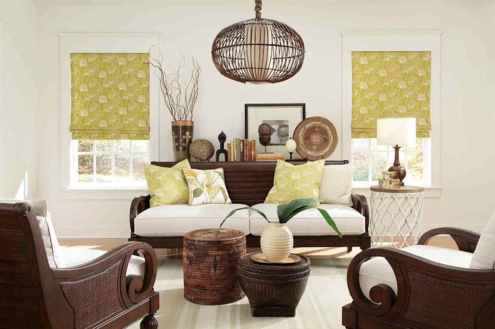
When you size up a room, there are three levels you need to consider: eye level, floor level, and midlevel. The eye level has to do with the walls: the color of the walls, window treatments, artwork, and fixtures. The floor level is everything that you walk on, whether that’s hardwood, carpeting or area rugs. The midlevel is what is in the middle of the room: furnishings and the accents, such as pillows, throws, accessories, floral arrangements, and greenery.
When placing color in a room, be sure to have the color flow in a curved fashion. To do that, you will typically include a color on two levels in at least three places. That way your eye moves easily among the objects in the room. It’s a pleasant, restful experience for your eyes, rather than a jarring, disjointed, or incompatible one.
Next, from your color theme, determine which colors will fulfill the roles of…
- Dominant color (60 percent of the room)
- Secondary color (30 percent of the room)
- Accent color (10 percent of the room)

The dominant color will be the main color, which will cover more of the space proportionately. It will encompass the walls, and possibly the floor. It may be included in some of the furnishings. The secondary color may be part of the flooring, and it and may be part of the furnishings and window treatments. The accent color will appear as highlights in appropriate places, such as one of the colors in the floral arrangement, in the upholstery pattern, in the pillows, or in the trim on any of the textiles in the room.
To keep this simple: If you elect to use three colors, one color will typically be on the walls and floors, another color will be on the furnishings, and another color will be an accent– possibly in the art, the textiles, the pattern on the sofa, the accessories, and/or the flooring (such as a small part of a pattern in an area rug). Intermingled, will be neutral colors (beiges, whites, blacks, and grays). Remeber to scatter the colors around the room.
As you translate the color palette into the room, you may use a patterned upholstery textile that will carry more than one color. Using patterns in a room allows you to create interest and to intermingle the colors of your theme. Your window treatments are another place to play with pattern and color. Remember – big patterns generally work best on big pieces, like sofas. Accessories can provide a welcome dash of accent color; throw pillows, fabric lamp shades, and object d’art should be chosen to complement and enhance your overall scheme, not quarrel with it.